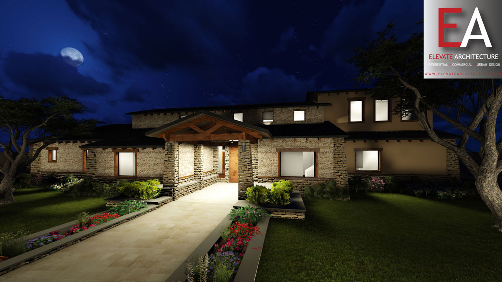
Elevate Architecture approached this McAllen remodel of a 1990’s Mediterranean home with a few guiding principles which fit within a singular concept. Generally speaking, the client was trying to update the look of the home to feel more modern/contemporary. The aesthetic problem to solve here was that the house was built in a traditional style and its shell would not change, and the space plan of the existing interior still largely felt traditional so a complete gut was not an option. We had to work within the confines of the traditional palette. The solution to derive what is now commonly referred to a “transitional” style. The idea behind the transitional style is that lines are simplified and generally clean, but the overall design is interwoven with traditional elements like crown moldings, Greco-Roman columns, and arches. Neither group of architectural elements takes precedence though.
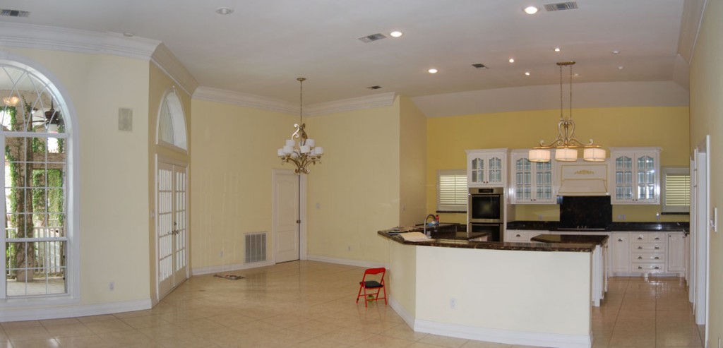
(Before picture of kitchen)
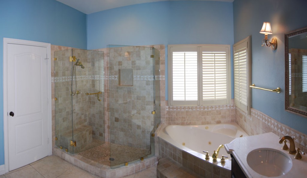
(Before picture of master bathroom)
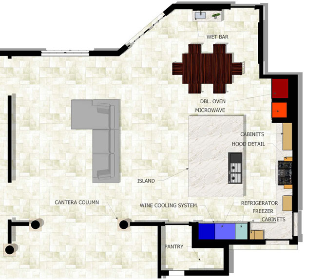
We started with the kitchen. Although the house was not to be gutted, the kitchen and master bath we were OK to start anew. The client was going to update the appliances and add a few more including the Miele refrigerator, freezer, and wine cooling system, a Miele convection oven. With the focus quickly aimed at the appliances, a concept of dividing the open plan kitchen into “hot” and “cold” zones.
In plan the hot zone is denoted by the red areas, and the cold by blue.
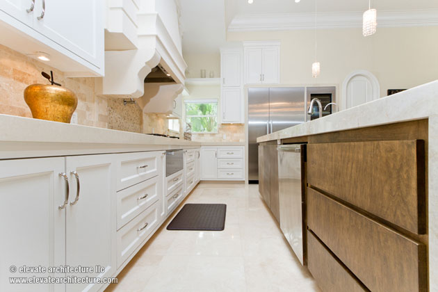
A quartz or natural stone material would wrap around the zones and then turn horizontal to become the countertop.
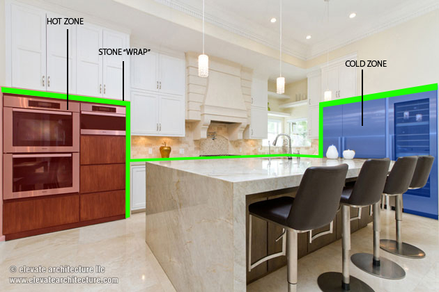
The counter top material and thickness about 3 and a half inches thick became the datum in the design concept since it wrapped the appliances, the counter, and the very large kitchen island.
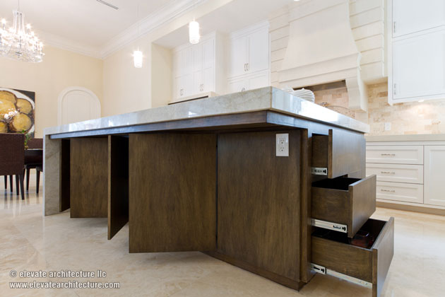
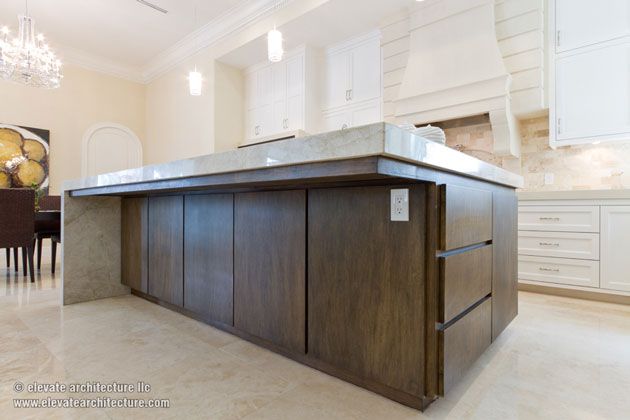
After we established the concept, our attention moved to the island. The client wanted a large island to act as a secondary eating “nook” area separate from their dining table.
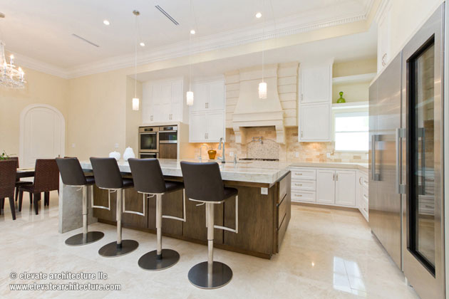
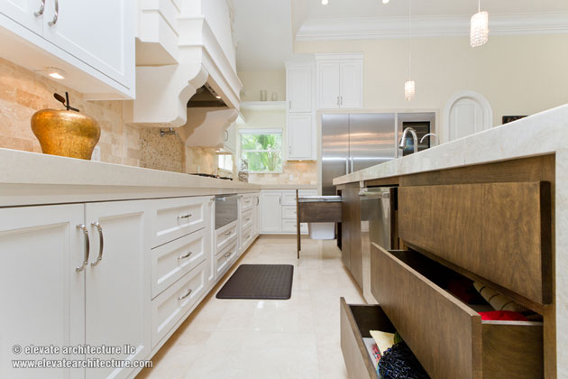
Because the island was so large we were intentional about designing the island with as much storage space as possible.
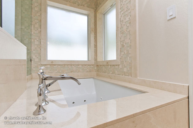
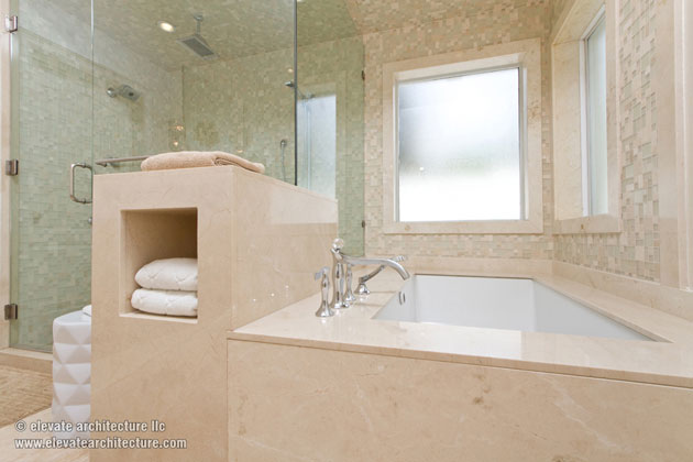
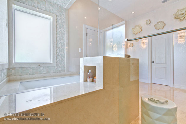
Moving on to the master bathroom we continued the “transitional” aesthetic with a little more emphasis on the modern component. The waterfall counters and flat panel cabinets lend themselves more to that modern aesthetic.
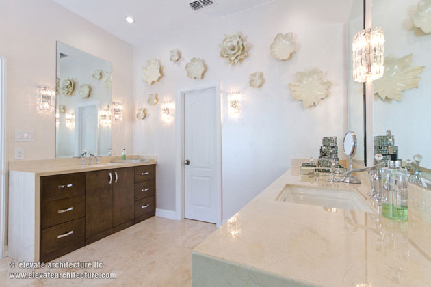
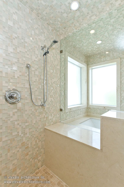
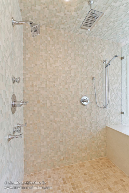
The shower is roomy and has a bench with compartments to hide bathing supplies. There is another compartment for towels facing the main space. Glass mosaic tiles clad the shower/bath interiors.

The remodel turned out great, but the success of a project like this always comes back to the client’s ability to let the creative process flow and take shape.

