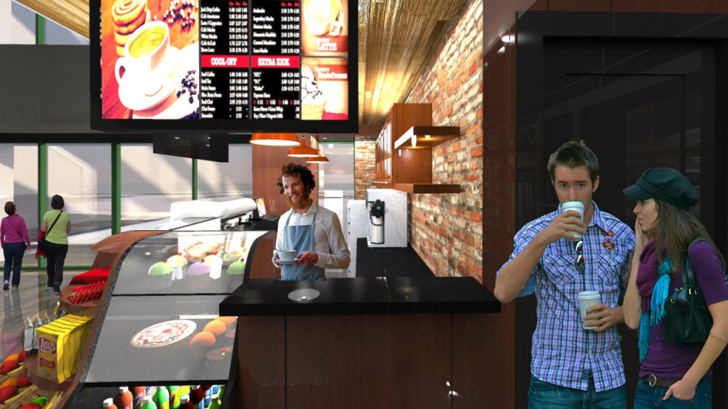
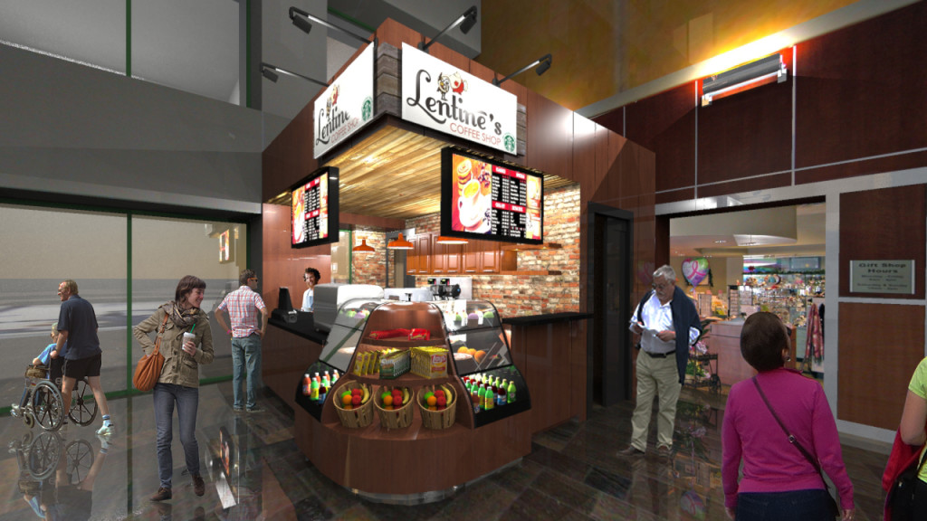
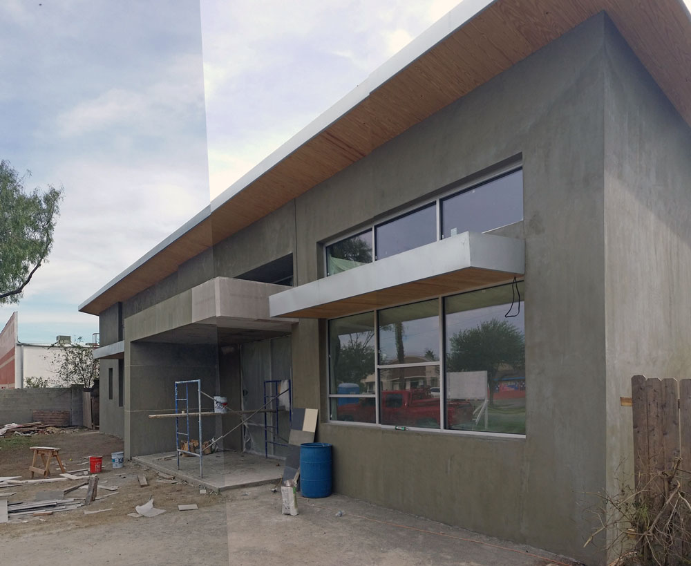
This was a short and sweet project which we enjoyed helping our service provider client with. Nothing drives interest to a food vendor more than the quality of food. In terms of the design however, architects do their best to draw attention to a space through the manipulation of form. In this case we are able to create an attention grabbing design primarily through a dramatic canopy that cantilevers over the main service area. The signage and monitors overhang customers 10 feet below. A rounded and protruding corner merchandise area does the rest.
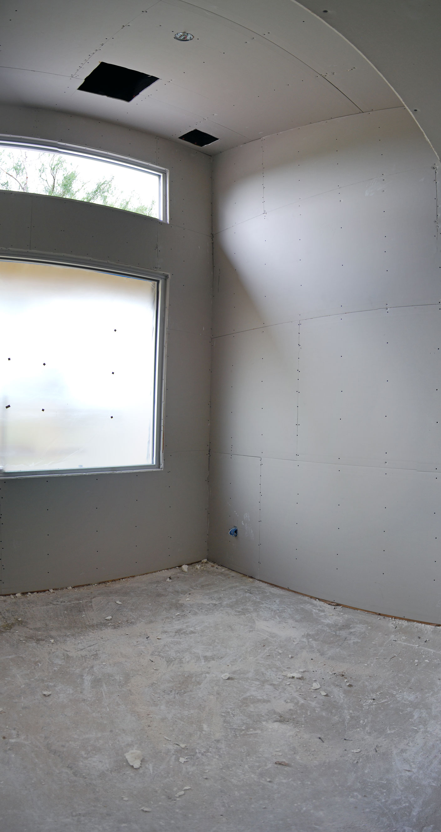
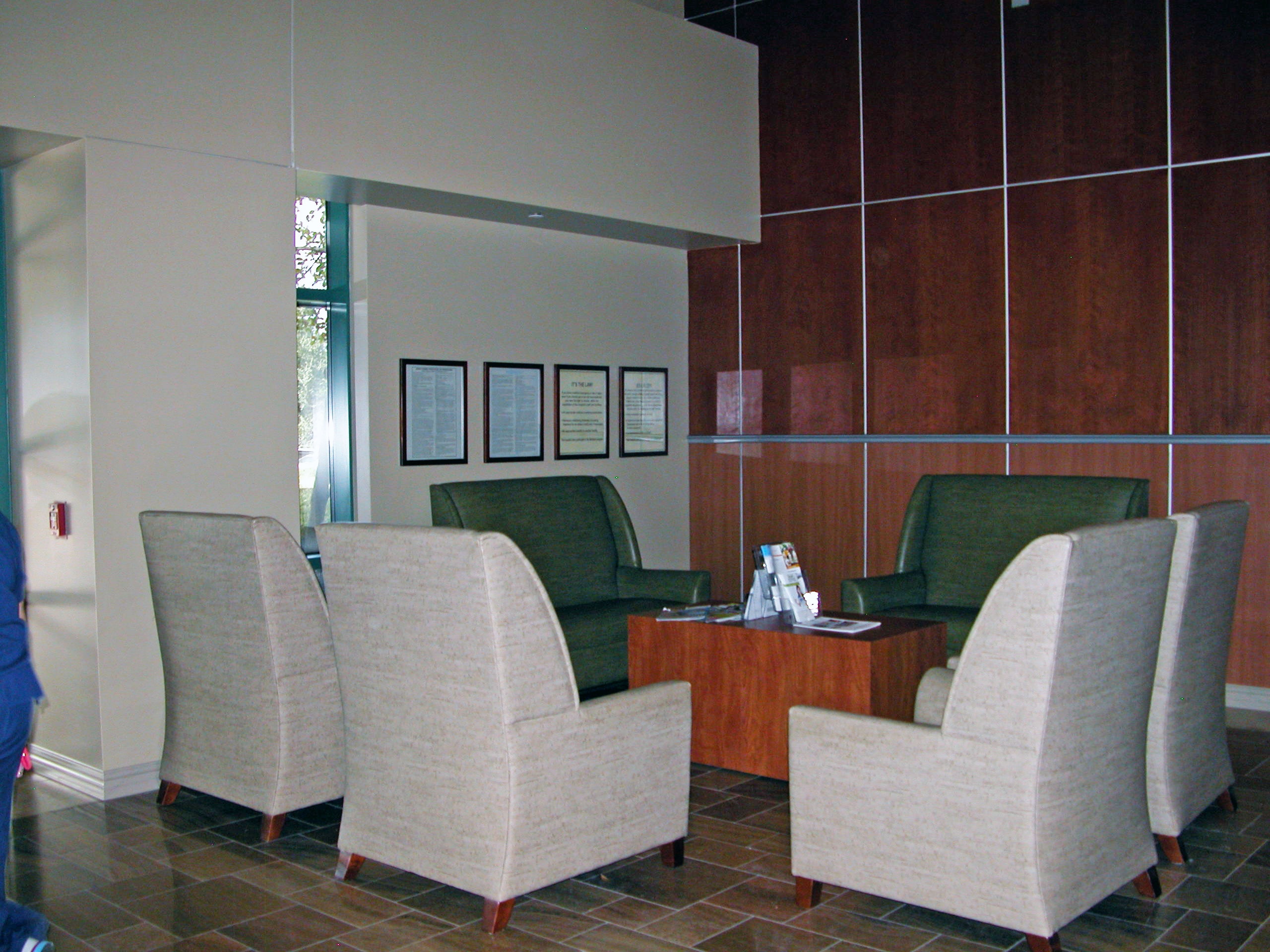
(Above) Picture of existing corner space where cafe will eventually go.
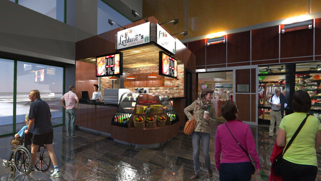
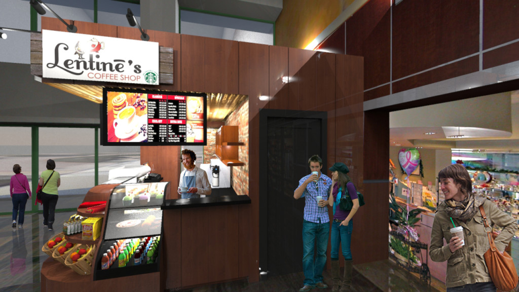

We think the tenants, and hospital visitors will love this new addition.

