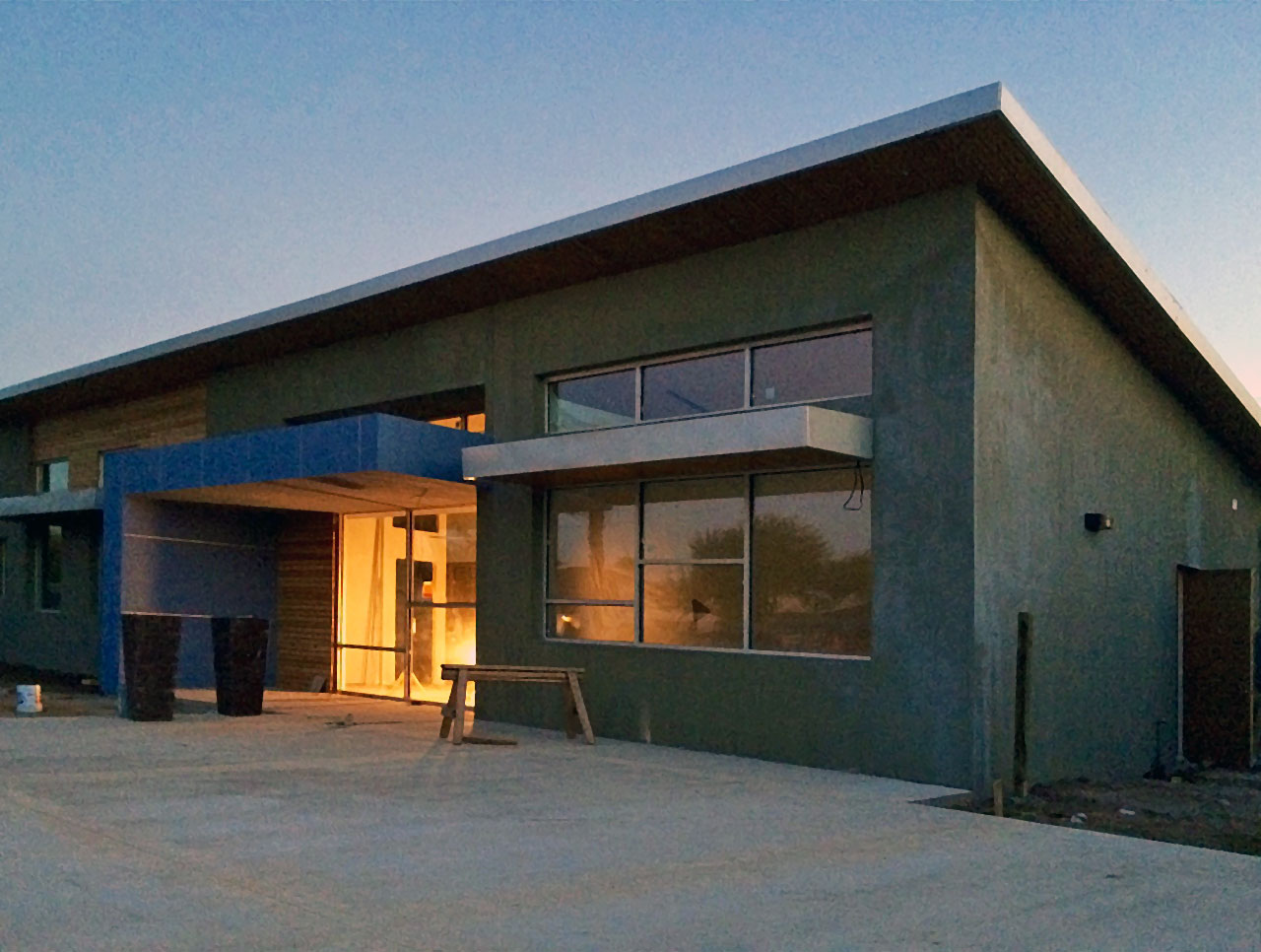
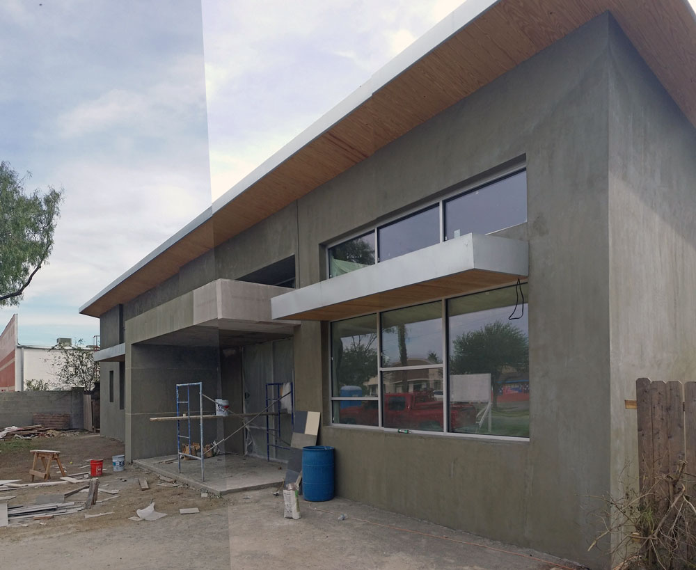
In most cases, office design in South Texas falls within a fairly standard set of rules and ideas: 4 walls, Spanish Colonial style,EIFS finish painted in natural non-offending tones. The fairly simplistic and non-evoking (vernacular should I say) architecture leads one to think that the bulk of the costs must go into the interior finishes and furniture. Afterall, with few exceptions in South Texas .99999% of time and money is spent on design while the remaining 99.11111% is spent on construction. While this is an obvious exageration, I would argue that the thought process is not very far from the truth….. /end/rant
Once in a while, a client comes a long who has an appreciation for art and thought provoking architecture, and is willing to make the effort to attain it in his/her own space. Attorney John Escamilla made that leap when he approached Elevate Architecture earlier in 2014. He made it clear that wanted something more for his office space, and gave us the mandate to “come up with something”. The challenge of course was making this happen by starting with an existing 1950′s single family residence with an 8 and a half foot plate height on only 2,300 SF. Escamilla had already decided to add about 500 SF more. So essentially this will end up being an “extreme remodel” if we can even call it that.

From the begining, the design of the Escamilla Law Firm buiding began with a metaphore about truth and transparency. We felt that these principles were at heart of Escamilla’s practice. We started with a sketch of interlocking parts.
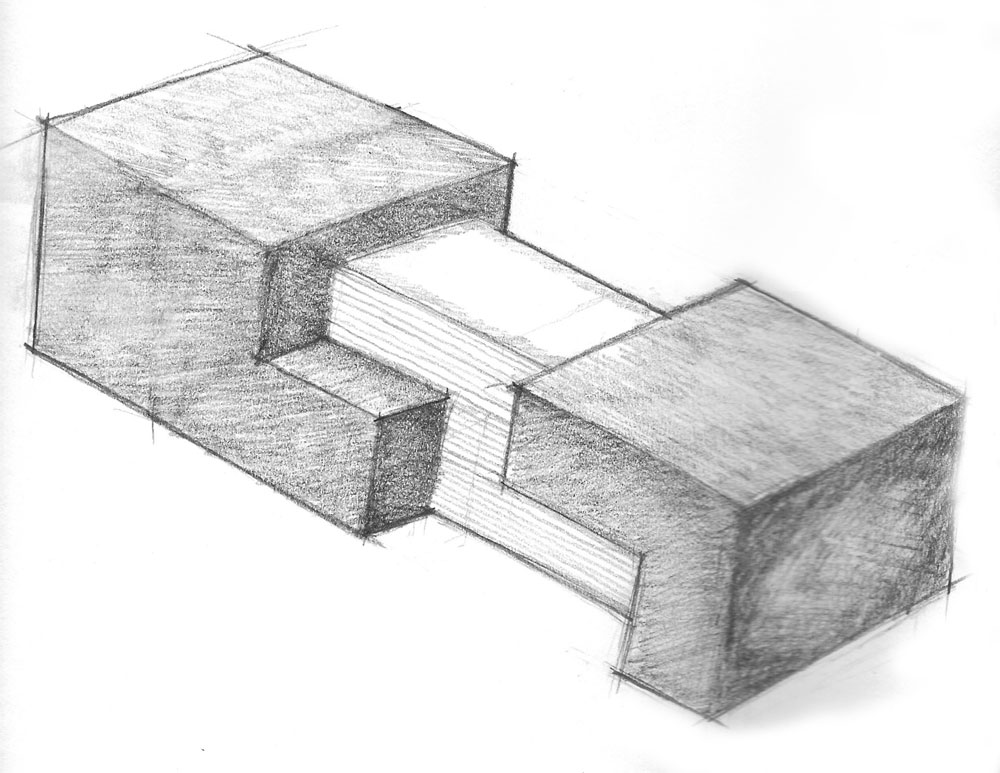
The idea behind the sketch is that an opaque veneer can conceal the inner beauty of an oject…gold in rock ore, a gem inside a geode…etc. Likewise, during a dispute, the truth often is hidden behind the coarse, and opaque walls of language and circumstance. Essentially the art of law has to do with utilizing evidence and language as a tool to pull apart that opaque barrier. When this process is successfu,l a beautiful thing emerges…the truth. Even in its sometimes actual ugliness the truth always carries its own fundamental beauty.
From that initial sketch we were able to quite literally represent the metaphore in the orginal facade composition. As you can see in the sketch bellow, the darker concerete block walls mirror the opaque nature in the visual metaphore. In the facade, again, we recreate the metaphore by pulling apart the block walls to reveal the inner beauty of the metaphore represented in the architecture by a golden brown array of cedar planks.

The design process thereafter included several verions of the concept with a roof and without a roof, single slope roof, or butterfly roof; as well as a variation on exterior finishes. Additionally, we layered on other architectural elements such as a canopy and window awnings, fenestrations, etc.
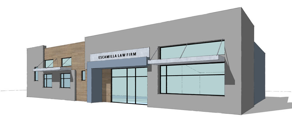
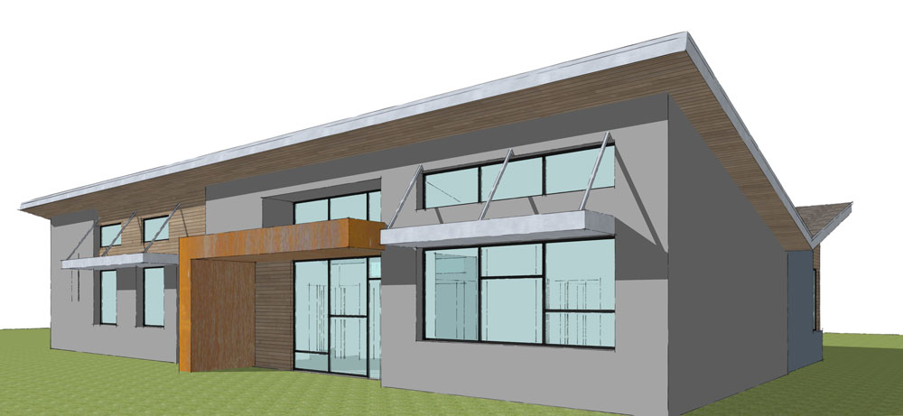
The design began to evolve into a collection of architectural elements that compliment the initial massing of the facade. The elements such as the windows establish a strong datum along the facade that cleanly breaks up the the mass of the 3 interlocking shapes of stucco, and cedar. A sidways “L” for a canopy that is clad in blue Hardie panels with the reglet reveal system (seen in final renders) is another architectural element that both helps soften the literal representation of the architectural metaphore as well as brings a beautiful and colorful contrast to austere concrete looking stucco.
On the interior, the idea of “transparency” was the guiding metaphor, and architectural theme. During the schematic phase we came up with some cross sectional sketches to represent that idea in the building. As you can see in the sketch, the design includes large north and south facing windows and high clerestory windows in the hallway which seperates the north and south offices.
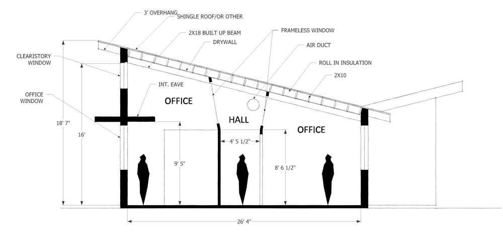
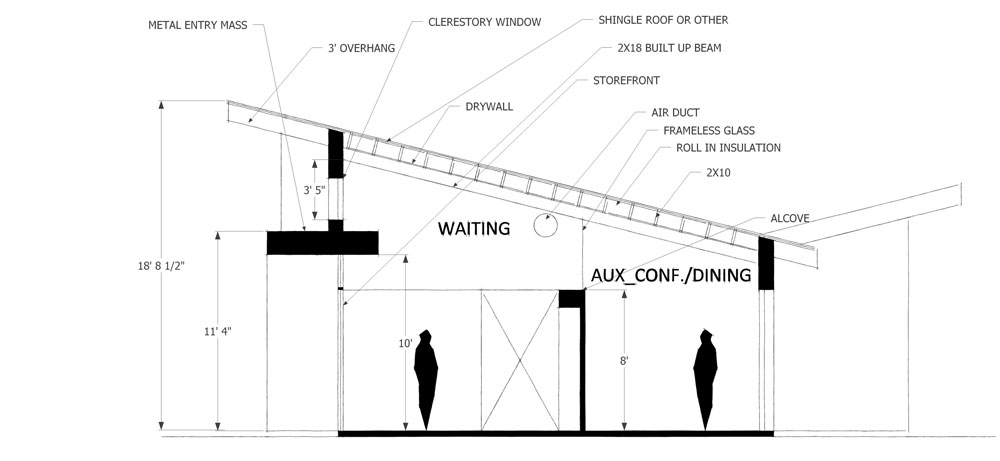
These clerestory windows draw light through the cross section so as to make the building literally transparent. The end result is office space with exceptional daylighting, but most importantly, by raising celiings high, and filling rooms with sunlight we are able to create interiors which feel much larger than they actually are. We knew that with such large windows we were up against a big challenge when dealing the scorching South Texas sun. Nevertheless we used a window specification that ended up meeting our engery code requirments although it has a light gray, blue, or green tint. We continued this theme of tranaparency by using clerestory windows in the lobby as well.
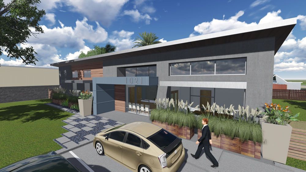
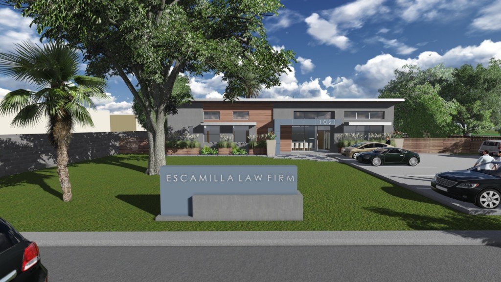
Overall, everyone was quite pleased with the outcome of the design. We were able to salvange the existing concrete foundattion and most of the exterior walls. Indeed almost all of the interior walls are to be demolished, but we figured salvaging as much of the existing building would save in material cost in the end. As of August 2014 the project is in construction. We exepect an end date sometime in mid to late January. We will be posting updates on this exciting project for McAllen in the weeks and months to come.


